
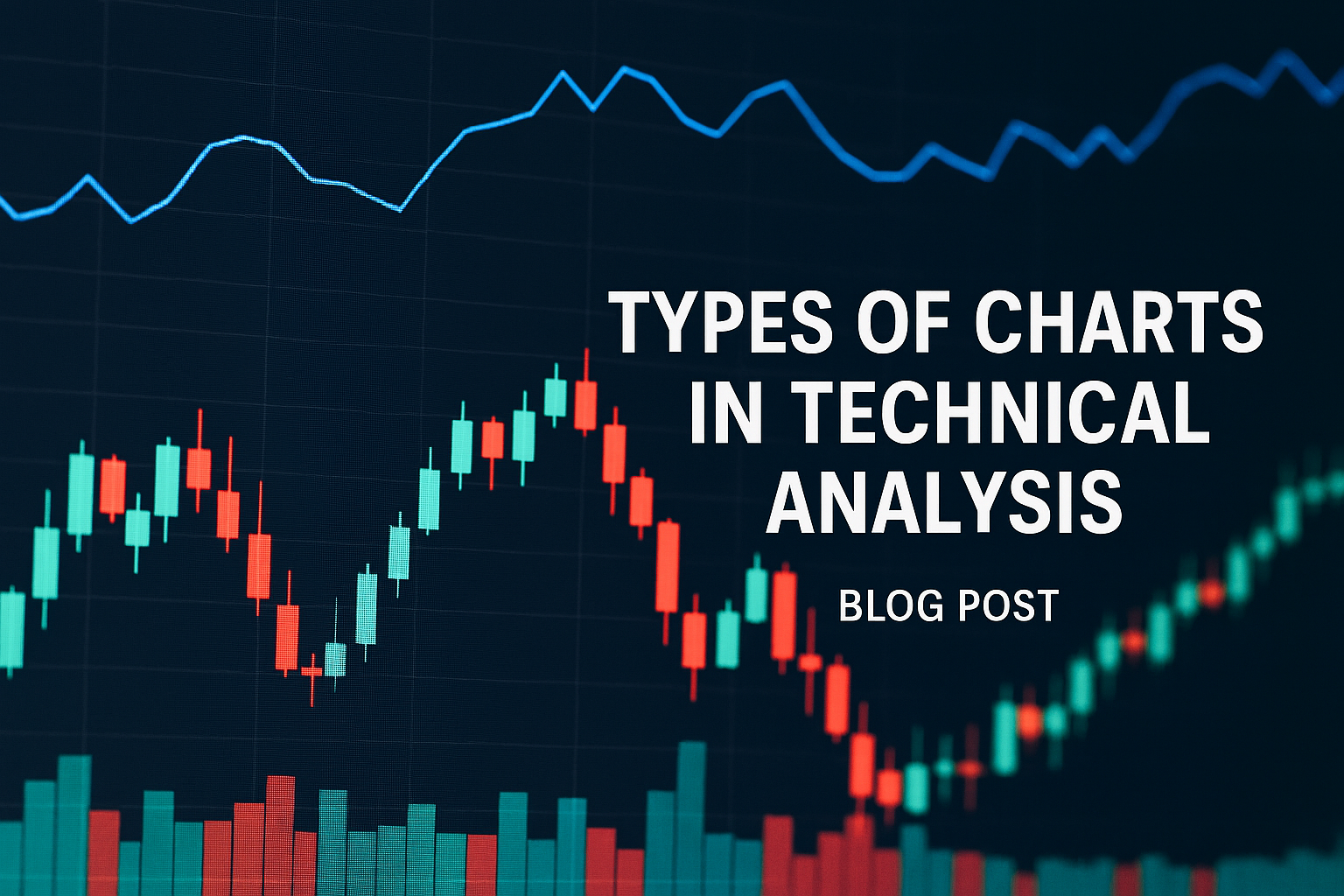
Choosing the right chart is the first step toward understanding market sentiment, spotting trends, and making informed trading decisions. In this blog, we’ll dive into the core chart types used by technical analysts, break down their constructions, & outline when and how to apply each in your trading strategy.
1. Line Charts
A line chart plots a series of data points—typically closing prices—connected by straight lines over time.
- Construction
• Points: Closing price for each period
• Connection: Straight line between consecutive close prices - Strengths
• Clarity: Highlights the overall trend without noise
• Simplicity: Easy to read for beginners - Limitations
• Ignores intraday highs, lows, and open prices
• May miss short-term price action signals - Best Used For
• Identifying long-term trends
• Comparing multiple securities side-by-side
2. Bar (OHLC) Charts
Bar charts visualize four key prices—open, high, low, and close—for each period.
| Component | Representation |
|---|---|
| Open | Horizontal tick on the left |
| High | Top of the vertical line |
| Low | Bottom of the vertical line |
| Close | Horizontal tick on the right |
- Strengths
• Comprehensive: Shows full price range within a period
• Versatile: Used for pattern recognition (e.g., reversals) - Limitations
• Can appear cluttered on short timeframes
• Requires learning curve to interpret ticks - Best Used For
• Detailed price action analysis
• Spotting support/resistance levels
3. Candlestick Charts
Candlesticks are a stylized variant of bar charts that emphasize the relationship between open and close.
| Element | Description |
|---|---|
| Body | Rectangle between open and close; color-coded (often green/red) |
| Wick | Lines extending from the body, indicating high and low |
| Color | Green (bullish: close > open) or Red (bearish: close < open) |
- Strengths
• Visual clarity: Quickly shows bullish vs. bearish periods
• Pattern library: Dozens of candlestick patterns for signals - Limitations
• Patterns can be subjective without context
• Prone to false signals in choppy markets - Best Used For
• Timing entries/exits via pattern recognition
• Reading market psychology and sentiment
4. Point & Figure (P&F) Charts
Point & Figure charts filter out time and focus solely on price changes.
- Construction
• X-column: Rising price boxes
• O-column: Falling price boxes
• Box size & reversal criteria: User-defined thresholds - Strengths
• Noise reduction: Ignores minor fluctuations
• Clear trend lines and breakout signals - Limitations
• Less intuitive for time-based traders
• Requires parameter tuning for different securities - Best Used For
• Identifying strong support/resistance zones
• Trend following without time bias
5. Renko Charts
Renko charts are built using bricks of fixed price movement, filtering out minor volatility.
- Construction
• Bricks added when price moves a set amount
• No bricks for sideways or minor moves - Strengths
• Streamlined trend visualization
• Effective at eliminating market noise - Limitations
• Delayed signals during consolidation
• Arbitrary brick size choice impacts signals - Best Used For
• Trend confirmation
• Trading breakouts with clear momentum
6. Heikin-Ashi Charts
Heikin-Ashi charts modify candlesticks to show smoothed trends.
- Construction
• Uses averaged open, high, low, close formulas
• Produces smoother “candles” - Strengths
• Filters out minor reversals for clearer trends
• Reduces whipsaws in choppy markets - Limitations
• Lagging nature; slower to signal reversals
• Not ideal for precise entry/exit points - Best Used For
• Riding extended trends
• Holding positions longer
Conclusion
By exploring Line, Bar (OHLC), Candlestick, Point & Figure, Renko, and Heikin-Ashi charts, you’ve gained insight into how each visual tool isolates different aspects of price action—from long-term trend clarity to noise-filtered momentum. Choosing the right chart type depends on your trading style, time horizon, and the level of detail you need for pattern recognition.
Experiment with each chart in a demo or paper-trading environment to discover which suits your workflow best. Remember:
- Line charts simplify trend analysis when you want a big-picture view.
- Bar and Candlestick charts combine range and sentiment for detailed entry and exit signals.
- Point & Figure and Renko charts strip away time to highlight pure price moves.
- Heikin-Ashi smooths out fluctuations for more consistent trend rides.
Integrate these chart types with complementary indicators—like moving averages or RSI—to enhance signal confirmation. As you backtest strategies against historical data, you’ll develop the confidence to tailor your charting toolkit, refine your timing, and ultimately elevate your market decisions. Keep practicing, stay disciplined, and let your chosen charts guide you toward more informed trades.